
OVERVIEW
Problem
Our initial research indicated that the (PDP), product detail page, was reporting high drop-off rates. In addition, there was lack of a luxurious feel to the design, leading to a lack of engagement.
CLIENT
The Hotel Collection
Outcome
My team conducted a competitive analysis and a heuristic evaluation from the reported data to inform our approach and ensure we created a design that was intuitive, organized, and reflective of the brand's luxury status.
Hotelcollection.com is where luxury meets indulgence.
The ecommerce company offers a wide range of exquisite scent collections, including candles, room sprays, and oil diffusers, which will transport you to a world of sensory bliss.
INFO
Role
Design Manager
Team
Design Manager (me), CRO Strategist (Farid) & UX/UI Designer (Kudi)
Timeline
3 Weeks

UNDERSTANDING THE PROBLEM
Why are we doing this?
2
Missing Brand Identity
The PDP design doesn't accurately reflect the brand, it is causing confusion, IN TU a lack of trust among users.
This is leading to missed opportunities to connect with potential customers and strengthen the brand's image.
1
High Drop-Off Rates
Our research indicated that a significant number of visitors who land on that page do not complete the desired action such as adding the product to their cart or making a purchase.
Instead, they leave the page without taking any further action or proceeding to the next step of the conversion funnel.
3
Poor User Experience
The PDP page is difficult to navigate and the product information is hard to find leaving visitors frustrated and not confident enough to make the purchase.
HYPOTHESIS
Redesigning the underperforming PDP page will lead to a decrease in drop-off rates and an increase in conversion rates by improving the overall user experience and addressing specific pain points that are causing visitors to abandon the page.
KEY OPPORTUNITIES
Overview of the previous experience
PAIN POINTS
1
3
Based on our data, these are the key areas of concerns based off our assumptions. The user experience was hindered by a confusing and bulky layout. The product line boasts a sleek and sophisticated aesthetic, with curved edges and a refined finish. The buttons on the current design, however, are blocky and do not align with the overall visual identity of the brand.
Furthermore, the information architecture of the website was in need of a complete overhaul. The organization and labeling of the content was not intuitive, making it difficult for users to locate the information they needed to make informed decisions. In particular, the call-to-action button was not prominently displayed and required significant effort to locate below the fold of the page.

The current design does not reflect industry best practices
Where Is The CTA Button?
The page lacks clear and compelling calls-to-action. The add-to-cart button falls below the fold and can not be seen unless you are scrolling down the page. In addition, there is no sticky add-to-cart bar.
Lost Revenue
By suggesting related or complementary products, a cross-sell feature can encourage customers to add more items to their cart, thereby increasing the average order value.
2
Subscription Information Confusing
There are too many areas of text focused around the subscription option which makes the desire to subscribe less appealing to the consumer.
4
Product Information Confusion
Adding a product detail toggle, has proven to be a valuable tool for enhancing the user experience and improving customer satisfaction. Keeping the product information organized and clearly defined will also reduce cognitive overload. This feature will also create a more user-friendly and satisfying shopping experience for their customers and tidy up the page.
STRATEGY
The plan of action
-
We were aware that users were dropping off the page, but after conducting competitive research analysis, we were able to identify several key components that our client could either revamp or include to enhance features such as product information, information architecture, and overall user flow.
-
Once we had a design hypothesis, we could create low-fidelity wireframes that depict the proposed changes to the PDP page. This would be a rough visual representation of the design, highlighting the key elements and functionality.
-
I provided the client with a detailed design walkthrough that highlighted the pain points of their current design and proposed solutions using basic wireframes. Once the client approved our proposed solutions, the UX design team began implementing the final design while adhering to the brand guidelines. Throughout the design process, we ensured that the user's needs and goals remained at the forefront of our design decisions, creating a seamless and effective user experience.
-
At this stage we run a A/B test to monitor the click-through rates and conversion rates, to determine which design performs better. Based on the results, the CRO strategist would make data-driven decisions to implement the winning design to improve overall website performance.
To address these concerns, I worked closely with our CRO strategists to identify the pain points and develop a strategy to improve the user experience.
Design process
SOLUTION
A conversion-optimized design
Before
MOBILE EXPERIENCE
Before

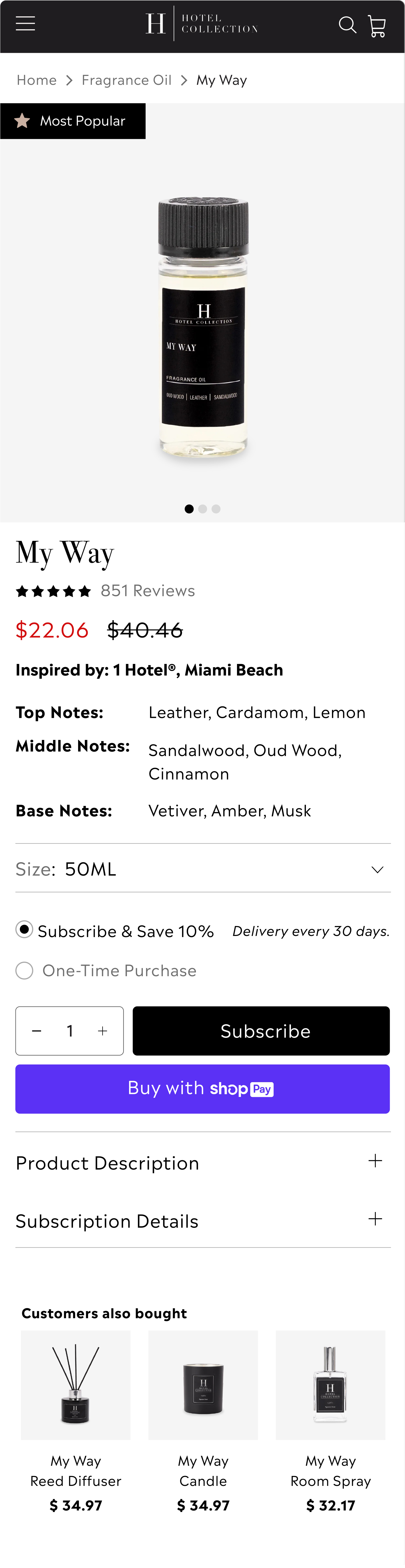
The new PDP design was created in just three weeks, resulting in a user-friendly and visually appealing interface that was ready for A/B testing to maximize conversion rates.

After

After
RETROSPECTIVE
Final Thoughts & Takeaways
2
Subscription Simplified
We've simplified the subscription process by implementing an accordion design. By doing so, we've saved more vertical space, and allowed the consumer to easily read the text at their own pace. This new design makes it easier and more straightforward for users to subscribe to our client’s service, ensuring a smoother and more enjoyable experience.
1
Functionality
We've improved the user experience by making the page more intuitive. Now, when a consumer clicks on the product size, the corresponding image will display, ensuring a seamless browsing experience. We also made sure to place the Call-to-Action (CTA) button above the fold, so users can easily find and interact with it without needing to scroll down the page. To further enhance the visibility of the CTA, we've changed its color to make it stand out and catch the consumer's eye.
3
Product Images Stand Out
By adding a subtle tone to the background of the existing images, we are creating a more visually pleasing and engaging experience. Additionally, we've improved the image carousel, making it even easier to browse through the product images. These changes work together to draw your eye towards the product.